

Ever stared at your website analytics and wondered why visitors aren’t converting? You’re getting decent traffic, maybe even great traffic, but something’s just… off. People land on your site, poke around for a few seconds, then vanish into the digital ether.
Here’s the thing most business owners don’t realize: your website might be accidentally pushing customers away. Not through bad content or wrong messaging, but through subtle design choices that create friction at every turn.
When Good Websites Go Bad
Last month, a SaaS startup came to us frustrated beyond belief. They were spending 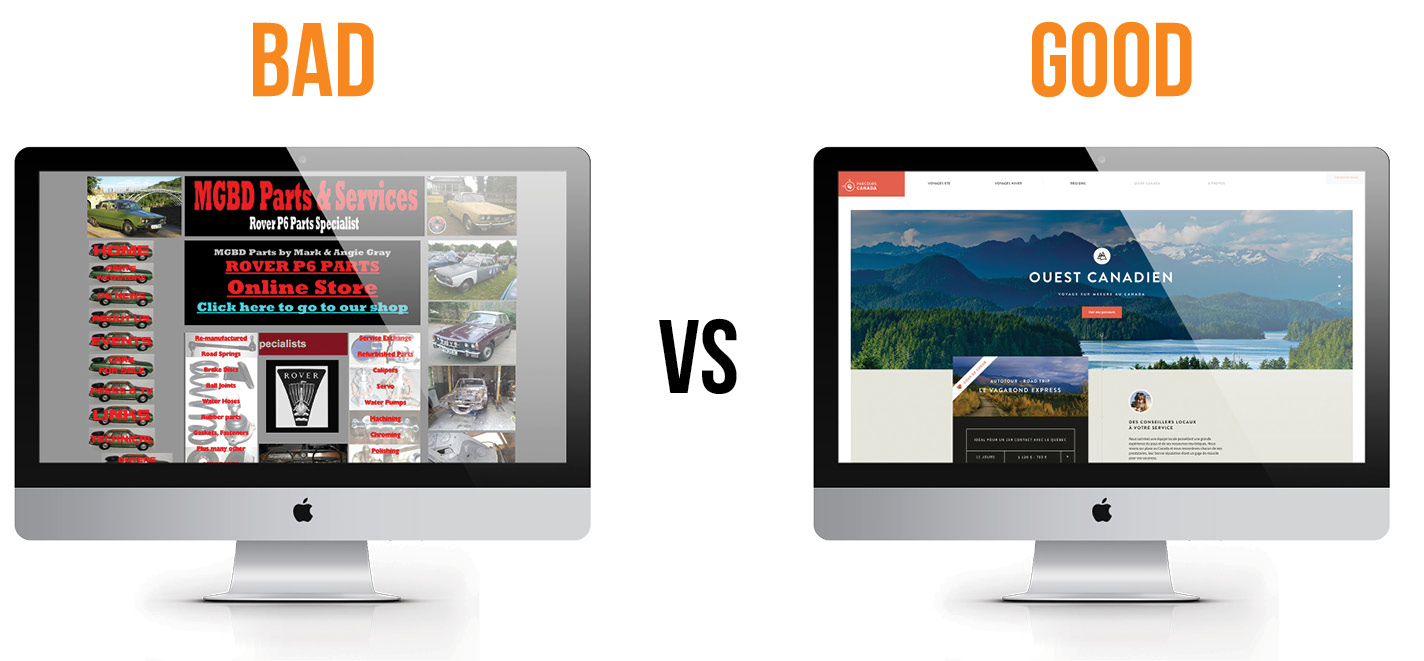 $15,000 monthly on ads, driving solid traffic to their landing page. But their conversion rate? A measly 1.2%.
The problem wasn’t their product or their pricing. Their homepage loaded in 8 seconds on mobile. Eight! By the time their page fully loaded, potential customers had already moved on to competitors.
But slow loading is just one conversion killer. There are dozens more lurking in plain sight.
The Navigation Nightmare Picture this: someone visits your website looking for pricing information. They scan your menu, click around, get lost in sub-menus, and eventually give up. This happens more than you’d think. When users can’t find what they need quickly, they assume you don’t want their business.
Mobile Mayhem Check your analytics right now. How much of your traffic comes from mobile devices? Probably over 60%, right? Now grab your phone and try to navigate your own website. Can you easily tap buttons without accidentally hitting something else? Is the text readable? These small annoyances add up to big conversion losses.
The Trust Problem Online shoppers are naturally suspicious. They’ve been burned before by sketchy websites and questionable companies. Without clear trust signals – real customer reviews, security badges, contact information that doesn’t look fake – even interested visitors hesitate to pull the trigger.
The 10-Minute Conversion Reality Check
Forget expensive audits and lengthy reports. Here’s how to spot conversion problems fast:
 First Two Minutes: The Speed Test Load your website on your phone using cellular data (not WiFi). Count slowly. One Mississippi, two Mississippi, three Mississippi. If you’re still counting past three, you’ve found problem number one. Google says 53% of mobile users abandon sites that take longer than three seconds to load.
Minutes Three and Four: The Thumb Test Still on your phone, try to complete your most important conversion action. Buy something, fill out a form, whatever. Use only your thumb. Notice where you struggle – those are the spots killing your conversions.
Minutes Five and Six: The Squint Test Step back from your computer screen and squint at your homepage. What jumps out first? Is it your main value proposition or some random graphic? Your most important message should be impossible to miss, even when squinting.
Minutes Seven and Eight: The Mom Test This one’s crucial. Could your mom (or someone equally non-tech-savvy) figure out what you do and how to buy it within 10 seconds? If not, you’re losing customers.
Final Two Minutes: The Competitor Peek Quick – visit your top three competitors’ websites. What do they do better? Sometimes the answer hits you immediately.
Why SaaS Companies Get Conversion Design Wrong
SaaS and tech companies face unique challenges that traditional web design approaches completely miss. Unlike selling physical products, you’re asking people to trust you with their business operations, often without being able to “touch” what they’re buying first.
The complexity creates problems. How do you explain enterprise-level software features without overwhelming someone? How do you build trust for a product that exists entirely in the cloud? These aren’t problems that standard UI UX design services typically understand.
Most design agencies approach SaaS websites like e-commerce sites. They focus on pretty layouts and smooth animations while missing the psychological hurdles that prevent SaaS conversions.
Real SaaS customers don’t just click “buy now.” They evaluate, compare, maybe trial your product, get approval from their boss, check references. Your website needs to support this entire journey, not just look impressive.
The Global Talent Advantage
Something interesting has happened in the design world over the past few years. Geographic barriers have mostly disappeared, but cultural understanding still matters enormously.
Working with a UX agency in India offers some compelling advantages beyond just cost savings. Indian design teams often bring fresh perspectives to American business problems. They’re not trapped in “this is how we’ve always done it” thinking.
Cities like Coimbatore have become unexpected design powerhouses. UI UX experts in Coimbatore are creating solutions for Silicon Valley startups, European fintech companies, and Australian e-commerce brands. The talent pool is deeper than most people realize.
But here’s what’s really smart – the best projects combine global perspectives. A UX agency US team might handle initial strategy and user research, while UI UX experts in India execute the detailed design work. This approach maximizes both creativity and budget efficiency.
Getting UI UX Implementation Right
Most companies approach website redesign backwards. They start with how they want  things to look instead of understanding how users actually behave.
Smart website UX design services always begin with research. Not fancy research – simple stuff like watching real users navigate your current site, reading customer service emails to understand common confusion points, analyzing where people drop off in your conversion funnel.
Then comes the prioritization part that separates good agencies from great ones. Not every design change delivers equal impact. Some fixes take five minutes and boost conversions immediately. Others require months of work with marginal improvement.
The agencies worth hiring focus on quick wins first. Maybe your signup button is the wrong color. Maybe your pricing page has too many options. Maybe your contact form asks for information people don’t want to share upfront. Fix these obvious problems before tackling complete redesigns.
Matching Design Strategy to Business Stage
Here’s something most articles won’t tell you: the right UI UX approach depends heavily on your business stage and goals.
Early-stage companies need what we call “scrappy conversion design.” Everything focused on proving product-market fit. The website should be lean, fast, and optimized for learning rather than looking perfect.
UI UX design for SaaS startups requires different thinking than established enterprise  software companies. Startups need flexibility to pivot quickly based on user feedback. They can’t afford six-month design projects that become outdated before launch.
Established companies face different challenges. They need designs that work across multiple user types, integrate with existing systems, and support complex organizational sales processes. A SaaS product UX agency understands these nuances.
Location matters too, but not always how you’d expect. Companies targeting American markets don’t automatically need US-based design teams. However, they do need teams that understand American business culture, compliance requirements, and user expectations.
Sometimes it makes sense to hire UX design team in US for strategic work while leveraging cost advantages by hiring UX design team in Coimbatore for implementation. The best UI design firm in India and US often combines both approaches seamlessly.
Beyond Quick Fixes
That 10-minute audit will reveal immediate problems, but lasting website conversion improvement requires ongoing attention. The most successful companies treat website conversion optimization as a continuous process, not a one-time project.
User behavior changes. Competitor offerings evolve. New devices and browsers create fresh challenges. What works today might not work next quarter.
The companies seeing consistent conversion growth do three things differently. They regularly collect user feedback through surveys and interviews. They test design changes systematically instead of making random updates. And they measure everything that matters to their specific business model.
The Real Conversion Breakthrough
Most business owners overthink website conversion optimization. They assume they need complete website overhauls, expensive design agencies, or complex testing setups.
Sometimes the biggest website conversion improvements come from smallest changes. Better button copy. Clearer value propositions. Simpler forms. Faster loading times.
Your next website conversion breakthrough might be hiding in plain sight. Those 10 minutes of honest evaluation could reveal the one change that transforms your business trajectory.
The question isn’t whether website conversion optimization works – it’s whether you’re ready to see your website through your customers’ eyes instead of your own.
Start with those 10 minutes. The insights might surprise you.

