

Picture this: Two nearly identical SaaS products launch on the same day. Same features, same pricing, same target market. Six months later, one is thriving with thousands of paying customers while the other struggles to convert even their free trial users. What made the difference? The answer often lies in something most founders underestimate—user experience design.
Here’s the brutal truth about digital products today: users have become ruthlessly efficient at making snap judgments. They’ll abandon a confusing checkout process faster than you can say “conversion optimization.” Yet many business owners still treat UI/UX design as an afterthought, like choosing curtains for a house with a shaky foundation.
Why Most Businesses Get Design Wrong
Walk into any startup office and you’ll hear the same conversation. “Our conversion rates are terrible, but we can’t figure out why. Our product is solid, our marketing is on point, and our pricing is competitive.” Sound familiar?
The problem isn’t always obvious because poor UX doesn’t announce itself with error messages. Instead, it creates silent friction. Users hit invisible walls—a form that’s too long, navigation that doesn’t make sense, or a value proposition that’s buried under jargon. They don’t complain; they just leave.
Take one e-commerce client we worked with last year. They were convinced their low conversion rate was a pricing problem. Turns out, their checkout button was the same color as their background. A simple design fix that took 20 minutes to implement boosted their conversions by 34% overnight. Sometimes the biggest breakthroughs come from solving the smallest problems.
The Real Psychology Behind User Behavior
Most discussions about conversion optimization focus on tactics—button colors, headline 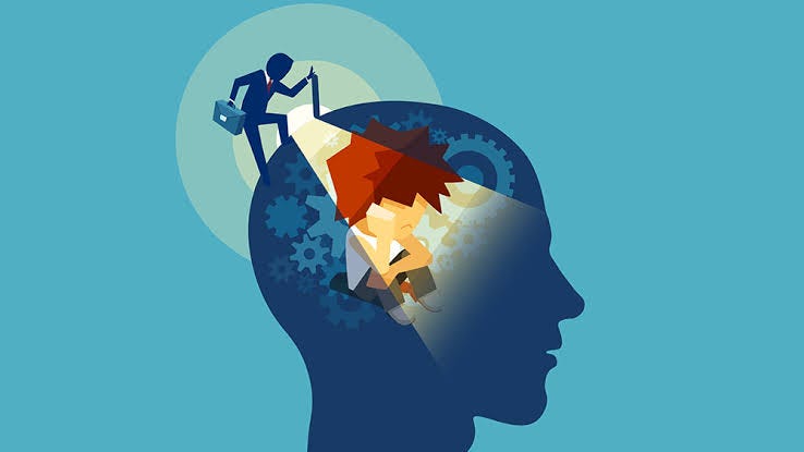 formulas, popup timing. But the most successful UI UX design services dig deeper into why humans behave the way they do online.
Decision Fatigue is Real Every choice you force users to make drains their mental energy. This isn’t just theory—researchers have documented how choice overload paralyzes decision-making. Amazon’s one-click ordering didn’t become famous because it was clever; it worked because it eliminated the mental burden of multiple decisions.
Smart designers understand this. They craft experiences that feel effortless, where the next step always seems obvious. When users don’t have to think about navigation, they can focus on whether they actually want your product.
Trust Happens in Milliseconds Stanford research shows people form opinions about website credibility in as little as 50 milliseconds. That’s faster than conscious thought. Users decide whether to trust your business before they’ve even read your headline.
This visceral response explains why a UX agency India working with global clients often sees dramatic differences in user behavior based purely on visual design choices. Cultural context matters too—what signals professionalism in Mumbai might feel sterile in San Francisco.
The Paradox of Choice Architecture Here’s something counterintuitive: reducing options often increases conversions. When Netflix reduced their content categories from dozens to just a few personalized rows, user engagement actually improved. Fewer choices, better outcomes.
The best website UX design services understand this paradox. They design what behavioral economists call “choice architecture”—structuring options in ways that guide users toward desired actions without feeling manipulative.
What Actually Drives Conversion Growth
Friction Auditing Every successful UX project starts with identifying friction points. But 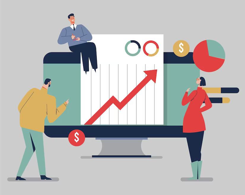 most businesses approach this backwards. They look at analytics and assume they understand user behavior. The reality is messier.
Real insight comes from watching actual users navigate your product. One SaaS product UX agency discovered their client’s biggest conversion killer wasn’t the pricing page or checkout flow—it was a confusing modal that appeared during onboarding. Users couldn’t figure out how to dismiss it, so they closed the entire tab instead.
Progressive Disclosure Information architecture isn’t just about organizing content—it’s about revealing the right information at the right moment. Users don’t want to see everything at once; they want to see what matters for their current task.
This principle becomes crucial for UI UX design for SaaS startups. New users need different information than power users. Cramming everything into a single dashboard creates cognitive overload that kills conversions before users experience value.
Emotional Journey Mapping Data tells you what users do, but it doesn’t explain how they feel while doing it. The most effective designs consider emotional states throughout the user journey. Anxiety during checkout, confusion during onboarding, frustration with search results—these emotional moments determine whether users convert or churn.
Industry-Specific Conversion Challenges
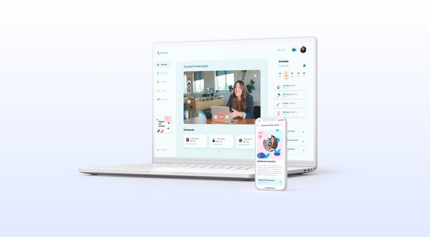
SaaS Products: The Onboarding Crisis Most SaaS companies lose users during the first session, not because the product isn’t valuable, but because users can’t figure out how to extract that value quickly enough.
The solution isn’t more features or better explanations—it’s reducing time-to-value. Users need to experience a “wow moment” within minutes, not hours. This might mean simplifying the initial setup, providing smart defaults, or guiding users to complete a meaningful task immediately.
E-commerce: Beyond the Buy Button Everyone obsesses over checkout optimization, but the real conversion killers often happen earlier in the funnel. Product pages that don’t address common concerns. Category navigation that doesn’t match how customers think about products. Search functionality that returns irrelevant results.
The most successful e-commerce designs anticipate questions before users ask them. They surface reviews at the right moment, provide size guides when needed, and make return policies visible without being pushy.
B2B Lead Generation: The Trust Equation B2B buyers are naturally skeptical because the stakes are higher. A bad consumer purchase might waste $50; a bad software decision can waste $50,000 and someone’s career.
Effective B2B design builds credibility through specificity. Instead of claiming to “help businesses grow,” successful companies show exactly which businesses they’ve helped and how. Case studies with real metrics, customer logos with context, pricing that demonstrates confidence rather than hiding behind “contact us.”
The Geographic Reality of Design
Cultural Design Patterns Working across US and Indian markets has taught many agencies that design preferences aren’t just aesthetic—they’re cultural. Information density expectations vary dramatically. Color associations carry different meanings. Even the concept of personal space translates to digital interface design.
UI UX experts in India often create designs that feel information-rich and detailed because local users expect comprehensive information before making decisions. Meanwhile, US users typically prefer streamlined experiences that emphasize speed and convenience.
Localization vs. Globalization The temptation is to create one design that works everywhere. But the most successful global products thoughtfully adapt their experiences for different markets while maintaining brand consistency.
This doesn’t just mean translating text. It means understanding that Indian users might want to see detailed specifications upfront, while US users might prefer interactive demos. Different markets, different conversion strategies.
Building Design Teams That Actually Convert
 The Agency vs. In-House Decision The choice to hire UX design team in US versus hire UX design team in Coimbatore often comes down to more than cost. It’s about matching team structure to business needs.
In-house teams understand your business intimately but can develop tunnel vision. External agencies bring fresh perspectives but need time to understand your market. The best UI design firm in India and US often combine both approaches—maintaining core capabilities internally while bringing in specialized expertise for major initiatives.
Beyond Portfolio Reviews Most businesses evaluate designers based on visual portfolios. But conversion-focused design requires different skills—user research, data analysis, systematic testing. The prettiest designs don’t always convert best.
UI UX experts in Coimbatore or anywhere else should be able to explain their design decisions in business terms. Why did they choose that layout? How did they validate their assumptions? What metrics improved after implementation?
Measuring Real Impact
Leading vs. Lagging Indicators Conversion rate is important, but it’s a lagging indicator. By the time you see conversion rate changes, you’ve already lost potential customers. Smart teams track leading indicators like user engagement depth, task completion rates, and friction point abandonment.
The Attribution Challenge When conversions improve after a redesign, was it the visual changes, better copywriting, simplified flows, or improved loading speed? Usually, it’s all of the above working together. This is why isolated A/B tests often miss the bigger picture.
The most successful projects treat design as a system, not a collection of individual elements. Colors, copy, layout, and functionality work together to create experiences that feel seamless and trustworthy.
The Competitive Advantage Nobody Talks About
 Great design creates a competitive moat that’s difficult to replicate. Features can be copied, pricing can be matched, but user experience advantages compound over time. Satisfied users become advocates, reducing acquisition costs. Intuitive products require less support, improving margins. Clear interfaces enable faster feature adoption, increasing customer lifetime value.
Companies that invest in professional UI UX design services aren’t just improving conversion rates—they’re building sustainable advantages that become more valuable as markets mature and competition intensifies.
The businesses thriving in today’s digital landscape understand something their competitors miss: great design isn’t about making things look pretty. It’s about removing the barriers between user intent and business goals. When that happens, conversions don’t just improve—they transform.

