Three weeks ago, I was grabbing coffee with Sarah, who runs a boutique marketing agency in Austin. She’d just lost what could’ve been her biggest client yet—not because her team wasn’t qualified, but because her website made her look like she was still stuck in 2018.
“They didn’t even respond to my follow-up email,” she told me, stirring her latte with obvious frustration. “I know we’re better than the agency they picked, but our site… God, it’s embarrassing.”
Sarah’s story isn’t unique. I hear variations of it constantly from business owners across the US and India. They’re brilliant at what they do, but their websites are quietly sabotaging every other marketing effort they make.
The thing is, web design services in 2025 aren’t just about making things look prettier anymore. Your website has become the first employee prospects meet, the credibility check they run before taking your call, and honestly? The silent partner that’s either growing your business or slowly killing it.
After spending the last fifteen years helping companies figure out why their websites aren’t converting, I’ve noticed something: the businesses thriving online aren’t necessarily the ones with the biggest budgets or fanciest designs. They’re the ones who actually understand what their users want—and more importantly, what makes them leave.
Why Your Current Website Probably Isn’t Working
Let me ask you something. When was the last time you actually used your own website the way a first-time visitor would?
I mean really used it—not just checked that your contact form still works or your latest blog post published correctly. I’m talking about landing on your homepage with zero context and trying to figure out what you do, why you’re different, and how to take the next step.
Most business owners I work with haven’t done this exercise in years. And when they finally do? The results are usually pretty sobering.
Your users aren’t just comparing you to your direct competitors anymore. They’re measuring your site against every digital experience they’ve had that week—from ordering coffee through an app to browsing Netflix to checking their bank balance online.
A professional web design company worth working with gets this. They understand that user expectations have been shaped by companies spending billions on user experience research, and your small business website needs to feel just as polished and intuitive.
The gap between “good enough” and “actually competitive” has gotten wider, and it’s only going to keep growing.
Trend #1: Websites That Actually Know You (Without Being Creepy)
 I was browsing a software company’s website last week, and something interesting happened. Instead of showing me their full product suite right away, the homepage asked one simple question: “What’s your primary challenge right now?”
Based on my answer, the entire experience shifted. Different case studies, relevant features, even the testimonials felt handpicked for someone in my situation. It wasn’t magic—just smart website UI design that adapts based on user input.
This is what personalization looks like when it’s done right. Not those weird pop-ups that somehow know you’re from Denver (seriously, those freak people out), but experiences that feel relevant because they’re actually useful.
I’ve seen accounting firms customize their homepage messaging based on whether visitors come from LinkedIn versus Google search. E-commerce sites that highlight different product categories depending on the time of day or season. Service companies that show local case studies to visitors from specific regions.
The key? It feels helpful, not invasive. When you work with a skilled UX UI design company US, they know how to walk this line perfectly.
Trend #2: Voice Search That Doesn’t Suck
 Okay, confession time. I used to think voice search integration was mostly hype—until I started using it regularly on websites that actually implemented it well.
Last month, I was trying to find specific pricing information on a SaaS company’s website while walking my dog. Instead of attempting to type on my phone with one hand (we’ve all been there), I just asked their voice search: “How much does the pro plan cost for teams under 10 people?”
Boom. Instant answer, no digging through pricing tables or FAQ sections.
The businesses getting this right aren’t just adding voice search because it’s trendy—they’re solving real user problems. Mobile users who don’t want to type. People with accessibility needs. Anyone trying to find information quickly while multitasking.
But here’s what I’ve learned from testing dozens of these implementations: voice search needs to understand natural language, not just keywords. Work with a UX design agency US or UX design agency coimbatore that actually tests how real people speak, not just how they type.
Trend #3: Micro-Interactions That Don’t Annoy People
There’s a fine line between helpful micro-interactions and those annoying animations that make you want to scream “just show me the content already!”
I’ve been tracking this trend closely, and the sites that get it right use micro-interactions to solve specific frustrations, not just to look fancy.
Like forms that show you password requirements as you type instead of after you submit and get an error. Or loading animations that actually tell you what’s happening instead of just spinning aimlessly. Shopping carts that give you instant feedback when you add items instead of making you wonder if the click registered.
The best responsive web design India projects I’ve reviewed lately treat micro-interactions like user interface problem-solvers, not decoration. Every animation serves a purpose—reducing cognitive load, providing feedback, or guiding attention where it needs to go.
My rule of thumb? If you can’t explain exactly how a micro-interaction helps users accomplish their goals faster or easier, cut it.
Trend #4: Speed That Actually Matters
I ran an experiment last year that made me slightly sick to my stomach. We took two identical landing pages for a client and made one version load 2.3 seconds slower than the other. Just 2.3 seconds.
The slower version lost 31% of its conversions. Thirty-one percent of potential customers just… left.
This isn’t abstract anymore. Google’s Core Web Vitals update means slow sites get buried in search results. Users abandon sites that feel sluggish. Your beautiful design means nothing if people don’t stick around to see it.
But here’s what most businesses miss—it’s not just about technical speed. It’s about perceived speed. A site that loads in 2 seconds but feels clunky and unresponsive will perform worse than one that loads in 2.5 seconds but feels snappy and immediate.
Modern web design India teams understand this distinction. They optimize for the feeling of speed, not just the technical measurements. They prioritize critical content, use progressive loading techniques, and make sure interactions feel instant even when data is still loading in the background.
 Trend #5: 3D and AR When It Actually Adds Value
I’ll be honest—I’m skeptical of most 3D and AR implementations I see on business websites. Too often, they’re added because someone thought they’d look cool, not because they solve actual user problems.
But when done right? The impact can be incredible.
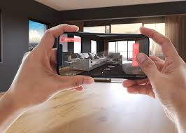
I worked with a furniture company last year that added an AR feature letting customers visualize pieces in their homes. Not because AR was trendy, but because returns were killing their margins. Customers were ordering sofas that looked great online but didn’t fit their space or aesthetic.
Six months after launch, returns dropped by 43%. Forty-three percent. The AR feature paid for itself in the first quarter.
The lesson? Don’t add immersive elements to look innovative. Add them to solve specific business problems. When website redesign services incorporate 3D or AR thoughtfully, they become powerful conversion tools. When they’re just eye candy, they slow down your site and confuse users.
Trend #6: Typography That Actually Works
Most people think typography is about choosing pretty fonts. After analyzing hundreds of high-converting websites, I can tell you it’s much more strategic than that.
Good typography in 2025 creates a visual hierarchy that guides users naturally through your content. It makes scanning easy, highlights what matters, and builds trust through consistency.
But here’s what kills most websites—typography that only works on desktop. I can’t count how many sites I’ve tested that look gorgeous on a large monitor but become completely unreadable on mobile devices.
The smart UX UI design company coimbatore teams test typography across devices, screen sizes, and even different lighting conditions. They choose fonts that load quickly, scale beautifully, and remain accessible for users with visual impairments or different language needs.
Typography should be invisible when it’s working well—users shouldn’t notice it, they should just find it easy to consume your content.
Trend #7: Decisions Based on Real Data, Not Opinions
 Here’s something that might surprise you—some of the most visually stunning websites I’ve seen have terrible conversion rates.
I remember working with a design agency whose own website was absolutely gorgeous. Clean layouts, perfect color palettes, animations that would make other designers weep with envy. Their bounce rate was 78%.
We spent two weeks analyzing user behavior, running heat map studies, and testing different approaches. Turned out users couldn’t figure out what the agency actually did or how to contact them. The beautiful design was getting in the way of basic communication.
After stripping away some of the visual complexity and making their value proposition crystal clear, conversions increased by 156%. Same talented team, same brand, just design decisions based on user behavior instead of aesthetic preferences.
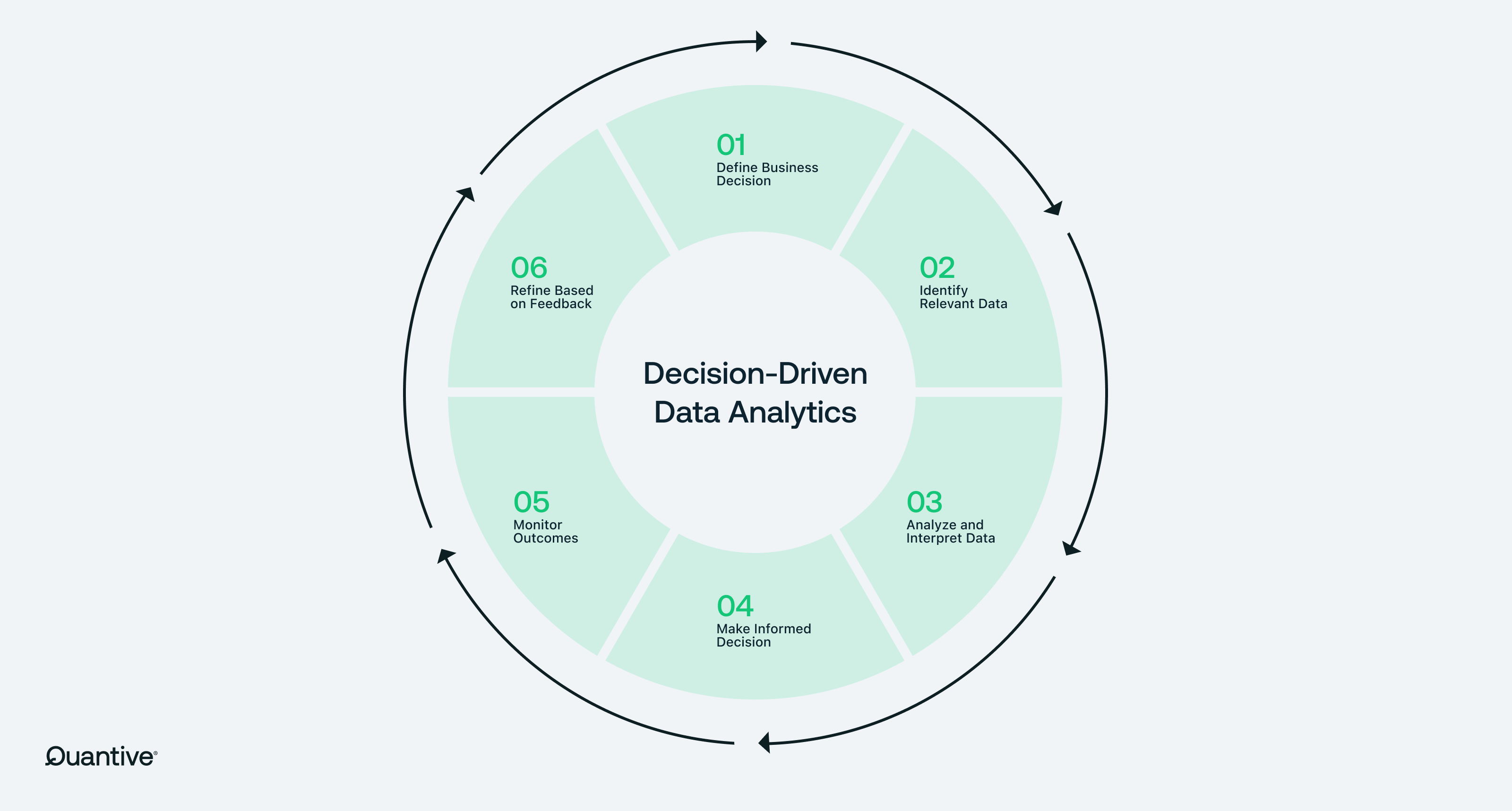
The businesses winning in 2025 use data to drive every major design decision. They test different approaches with real users. They analyze how changes impact actual business metrics, not just how many compliments they get on social media.
How to Actually Implement This Stuff
Look, I know this feels overwhelming. You don’t need to rebuild your entire website overnight to see results.
Start with performance. I can’t stress this enough—if your site takes more than 3 seconds to load, everything else is academic. Users won’t stick around long enough to appreciate your brilliant personalization or clever micro-interactions.
Next, fix your mobile experience. And I don’t mean “make sure it’s responsive”—I mean actually use your site on your phone and see if it’s genuinely pleasant to navigate. Most aren’t.
Then focus on one area where you can add strategic personalization. Maybe it’s showing different homepage messaging to visitors from different traffic sources. Maybe it’s customizing your contact form based on user selections. Start small and build from there.
The immersive stuff—3D, AR, advanced voice features—can wait until you’ve nailed the fundamentals. These are powerful tools, but they’re not going to save a website with basic usability problems.
Choosing Design Partners Who Get It
 Whether you’re considering UX design agency US options or exploring web design India teams, look for partners who ask about your business goals before they show you anything visual.
Red flags: Teams that lead with portfolios instead of questions. Agencies that talk more about awards than results. Anyone who promises to make your site “modern” without understanding what that means for your specific users and objectives.
Green flags: Partners who want to understand your customers first. Teams that talk about testing and optimization, not just design and development. Agencies that measure success by business metrics, not just traffic or time on site.
What This Really Means for Your Business
Your website isn’t just representing your business anymore—it’s actively growing it or holding it back. Every day you wait to address fundamental experience problems is another day you’re losing potential customers to competitors who figured this out first.
 The businesses pulling ahead aren’t necessarily spending more on design or development. They’re being more strategic about understanding what their users actually need and delivering it consistently across every touchpoint.
At Noukha, we’ve helped companies across the US and India transform websites from digital brochures into growth engines. Not by following every trend that comes along, but by implementing the ones that actually move the needle for each specific business.
Because at the end of the day, the best web design trend is the one that helps you serve your customers better and grow your business faster. Everything else is just noise.
Ready to stop losing potential customers to a website that doesn’t do your business justice? Let’s have a conversation about what’s actually possible when you get this stuff right.


